Email Templates
This feature allows you to use existing templates, to customize them or to set up completely new ones for the different automated sent out our app proposes.

Use the new WYSIWYG interface to adapt the default templates to your business needs.
Let us discover this section together!
Access to the email templates
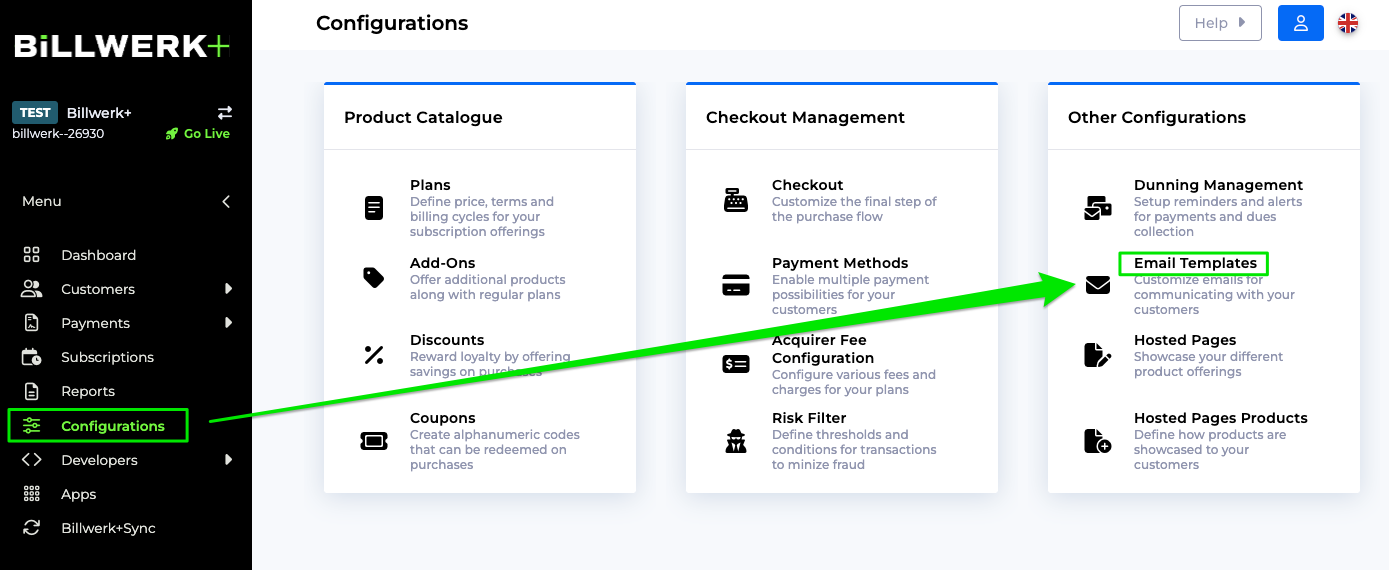
In order to check out the existing standard templates or to add custom ones, you can reach the interface by:
Clicking on Configuration in the left hand navigation bar.
Then click on Email Templates in the Other Configuration column.
The Reports page will open, showing you multiple options of reports :
Invoice templates: Email templates related to invoices
Subscription templates: Email templates related to subscriptions
Account templates: Email templates related to user account management
Webhook templates: Email templates related to webhooks
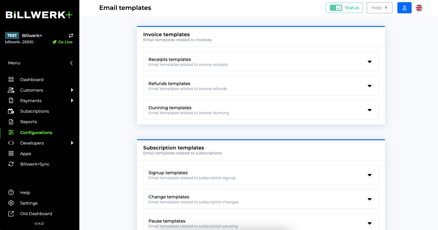
List of available email templates
You can use the following standard templates and create your custom templates for these use cases:
Invoice templates | Receipts templates | Invoice card receipt Sent when an invoice is successfully settled using a credit card transaction. |
Invoice manual receipt Sent when an invoice is successfully settled using a manual transaction. | ||
Invoice zero amount receipt Sent when an invoice of zero summed amount is settled without transactions. Plan with zero amount or credits higher than plan and additional cost amount can result in this scenario. | ||
Refunds templates | Invoice card refund receipt Sent when a refund is made for a settled invoice that was settled using a credit card transaction. | |
Invoice manual refund receipt Sent when a refund is made for a settled invoice that was settled using a manual transaction. | ||
Dunning templates | Invoice dunning notification Sent according to the dunning management scheme. | |
Invoice dunning notification no payment method Sent when the dunning invoice has no payment method added. | ||
Subscription templates | Signup templates | Signup receipt Sent when a customer has signed up to a subscription and the sign up method is not to send an email with a request to choose payment method for the subscription. |
Signup receipt request payment method Sent when a customer has signed up to a subscription and the sign up method is to send an email with a request to choose payment method for the subscription. | ||
Change templates | Subscription change Sent when subscription pricing or billing periods is changed on a subscription (the plan or the start of the next billing period is changed for the subscription). | |
Pause templates | Subscription on hold Sent when a subscription is paused. | |
Subscription on hold dunning Sent when a subscription is paused due to a failed dunning management process. This mail will often have different content than the normal pause mail. | ||
Subscription reactivated Sent when a paused subscription has been reactivated. | ||
Cancel templates | Subscription cancelled Sent when a subscription is cancelled. Includes when the subscription will expire. | |
Subscription uncancelled Sent when a cancelled subscription is un-cancelled. | ||
Expire templates | Subscription expired Sent when a subscription is expired either because of prior cancellation or because a fixed number of billing cycles has been reached. | |
Subscription expired dunning Sent when a subscription is expired due to a failed dunning management process. This mail will often have different content than the normal expire mail. | ||
Reminder templates | Subscription renewal reminder Sent X amount of days before a subscription is renewing, as a reminder that the customers card will be charged. | |
Subscription trial end reminder Sent X amount of days before the trial on a subscription is ending. | ||
Account templates | Invite templates | User account invite Sent when you invite others to join your team. |
User account notification Sent when an existing user is invited to manage a Reepay Dashboard. | ||
Verification templates | User email verify Sent when an existing user is requesting an email verification. | |
Reset templates | User password reset Sent when an existing user is requesting a password reset. | |
Webhook templates | Alert templates | Webhook failure Sent when a webhook fails repeatedly. |
Deactivate or reactivate an email template
In order to stop the Email notification from being send out:
You can access the template you would like to deactivate.
Open the accordion menu of the template group you are interested in by clicking on the name.
Use the toggle to deactivate or reactivate the template:

Caution
The Account templates and the Webhook templates can not be deactivated, since they are sending out system relevant notifications. Still you can customize them like the others.
Email type settings
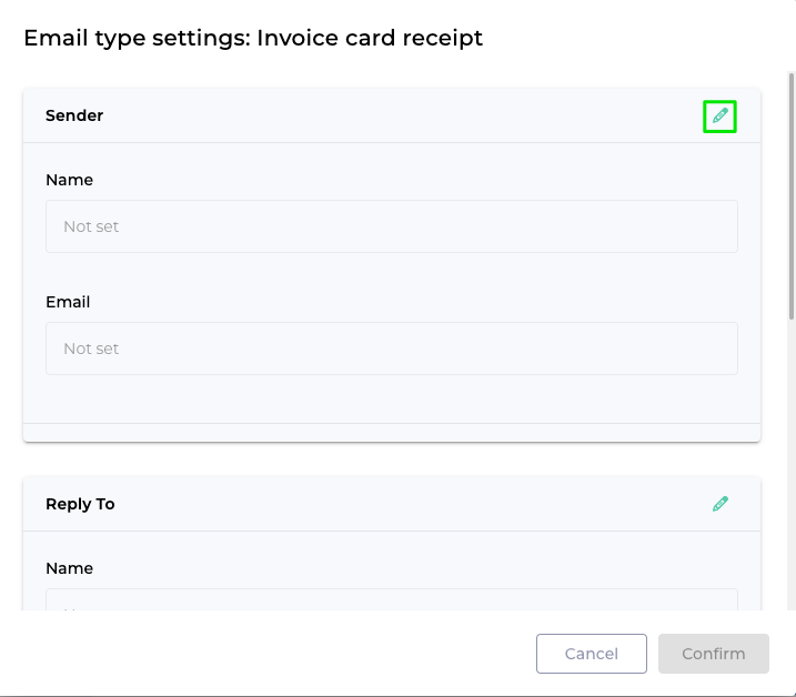
The Email Type Settings allow you to change the default email address you specified in the Email Settings on Email Template level. That means that you can customize this information for each of the templates we listed earlier.
Caution
Please be aware that changing the default email address on a specific template will overwrite the default email address for that template.
You can overwrite in this way the displayed name and Email address of:
The Sender
The Reply to
The Additional Emails: CC and BCC.
To access these settings, please read this article: Access to the email templates.
Then click on the
 icon behind the names of the template that you would like to customize:
Afterwards, click on the
 :
:
Click on
 after having read the error message:
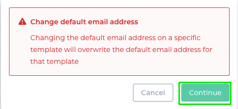
Then change the Name(s) and/ or Email address(es) you need to customize for the template.
Finally click on
 .
.
Great, you just changed the information you needed to customize your template's email settings.
Preview an existing email template
To access the Email templates, please read this article: Access to the email templates.
If you would like to open and preview and already existing template, please follow these steps:
From the Email templates page, click on the template group you are interested in.
Then click on the template name to open the accordion menu.
You see a list of existing templates for this use case:
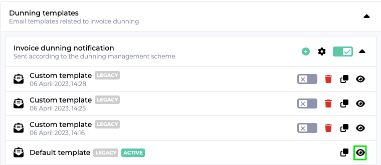
Then click on the
 to open the preview:
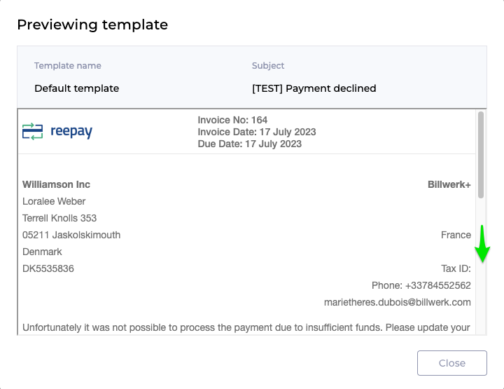
Scroll down to see the whole template.
Then click on
 .
.
Create a customized email template
There are two ways to create a customized template:
Either you clone an existing one (standard or custom)

Or you create a new template from scratch.
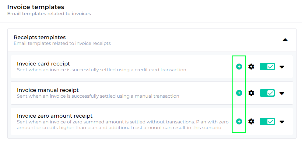
For both options you need
first to access the Email templates interface.
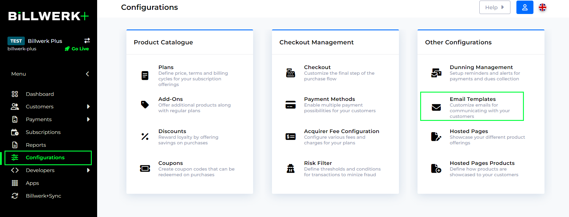
Then open the template group by clicking on the name. (Invoices then Receipts templates for examples.)
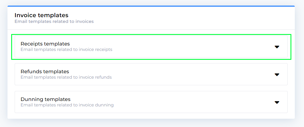
Afterwards, click on the name of the template you would like to customize.
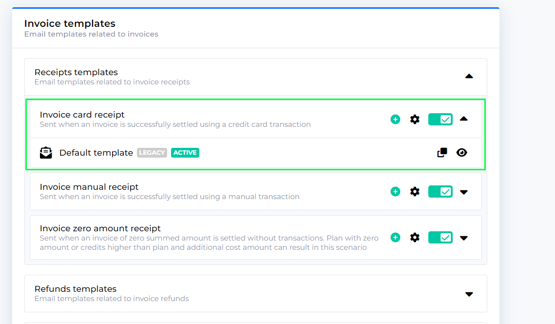
Clone an existing email template
Follow these steps if you would like to adapt a template with minor changes.
Click on the
 icon.
icon.
You will see the preview of the template you are about to clone.
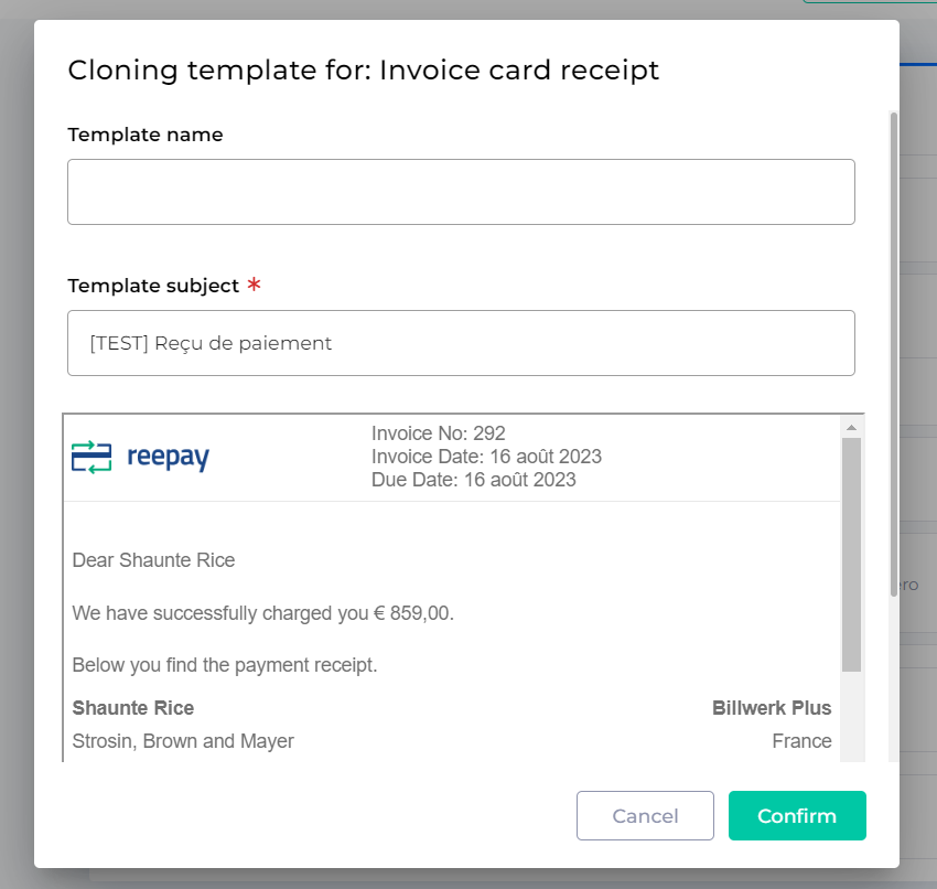
Insert a name for your clone.
Then click on
 .
.You are redirected to the list of templates.
Click on the name of your new template.
The Email editor will open.
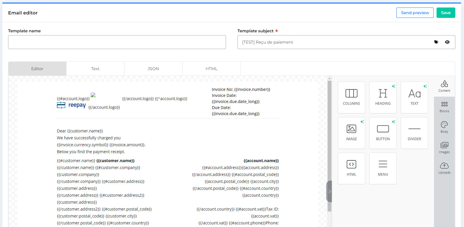
The email editor
Either you followed the previous procedure to clone an existing Email template or you clicked on the  icon to create a new template.
Both ways will open the Email Editor. The interface is composed by four tabs:
Editor: A drag and drop interface which allows you to add components to your template.
Text: A text editor that you can use to add Merge tags, Merge tags rules and conditions.
JSON: An interface that gives you the possibility to upload your JSON file and download the JSON file of the template.
HTML: You can see and copy the HTML output of your template.
We will focus first of all on the Editor and it's different components:
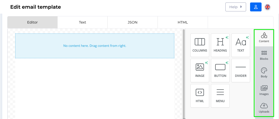
Content
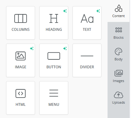
You have several components at your disposition to customize your email template:
Drag & Drop the columns component into the template to structure your email.

You can set the options for Desktop or Mobile devices.
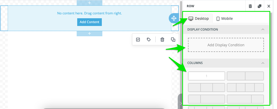
Add a Display Condition by clicking the box.
The Manage display conditions for the block window opens.
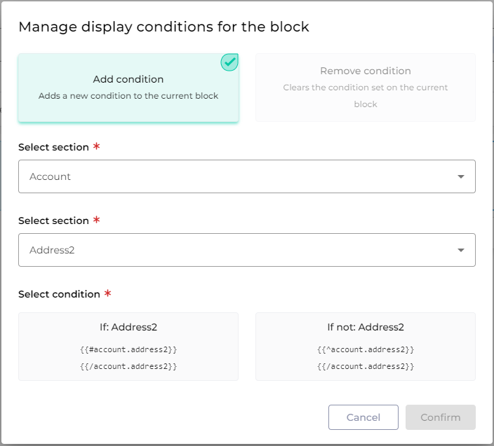
Click on Add condition.
Select the section where the fields for your condition should come from.
Then select the fields.
Decide whether the information should be available or not.
Click on
 .
.
In the Columns section you can decide on the distribution of your columns. You can display up to four columns in different ways. Click on the distribution you would like to see.
Note
In case you reduce the number of columns an error message will notify you that you are about to delete columns. That will delete the content of these columns.
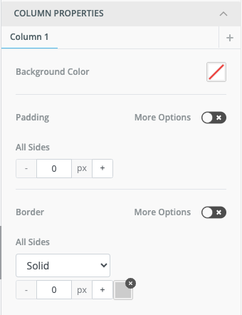
For each column you can set Column properties:
Note
You can activate more options to customize for each side of your cell the Padding and Border design.
The Row Properties allow you to specify the background and the padding of the row:
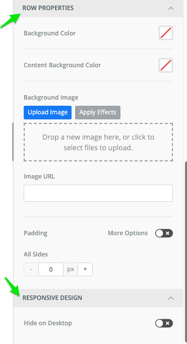
In the Responsive Design you can decide whether to hide or to show the column on the Desktop version (or in the other tab, see point 2, the Mobile version).
Drag & Drop the heading component into the template to insert a heading text block.

You can set the options for Desktop or Mobile devices.
Add a Display condition.
Use Smart Headings to generate automatically a headline by inserting at least two keywords:
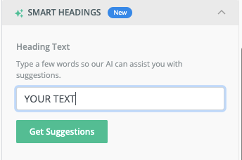
Click on Get Suggestions to choose the tone:
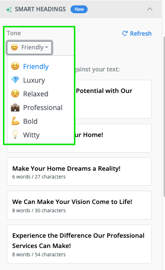
Click on Refresh to get more suggestions.
Then click on the suggestion to insert it into your template.
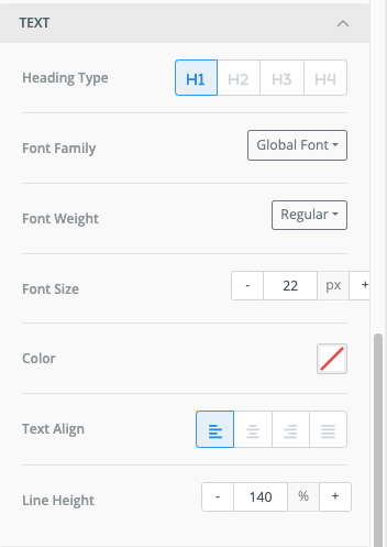
Set Text properties as the following:
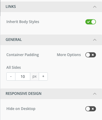
For Links you can decide not to inherit the body styles, which allows you to set a custom color and to decide to underline the link text or not.
If you toggle more options in the General section you can set the padding for the four sides around your header.
In the Responsive Design you can decide whether to hide or to show the header on the Desktop version (or in the other tab, see point 2, the Mobile version).
Drag & Drop the text component into the template to structure your email.
You can set the options for Desktop or Mobile devices.

Add a Display condition by clicking the box.
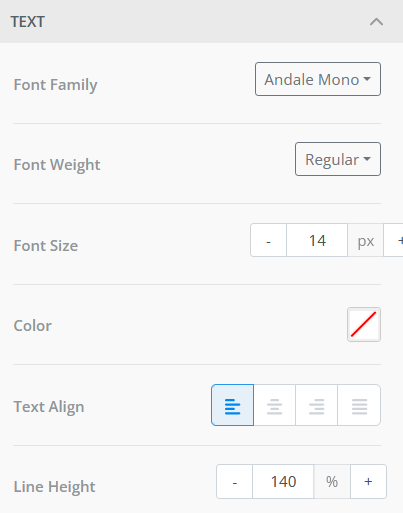
For each text-block you can set Text properties:
For Links you can decide not to inherit the body styles, which allows you to set a custom color and to decide to underline the link text or not.
If you toggle more options in the General section you can set the padding for the four sides around your text-block.
In the Responsive Design you can decide whether to hide or to show the text on the Desktop version (or in the other tab, see point 2, the Mobile version).
Note
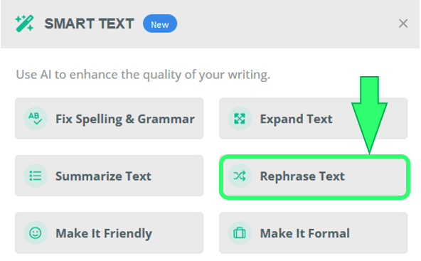
In addition, you can also use Smart Text functionality to make AI help you to create the required text. As an example, let us rephrase 'Greetings to all! It's nice to have you here!'
Click on the text-block and select Smart Text in the editing panel.
In Smart Text window use one of the various options of AI text-editing. We are going to make our text rephrased. Select Rephrase Text.
After a second, the AI rephrases the text-block to an alternative version 'Hello everyone! We are delighted to have you join us!'

Drag & Drop the image component into the template to insert an image.
You can set the options for Desktop or Mobile devices.

Add a Display Condition by clicking in the box.
Get an AI-generated custom image by selecting
.
Please provide a description of the image for AI to create it. As in the example 'video meeting with boss'. After that, click Generate Images.
After few seconds, there are four generated images ready to choose from for your template. If the image is chosen, hover over it and select Use Image.
The selected image will be automatically added to the email template.
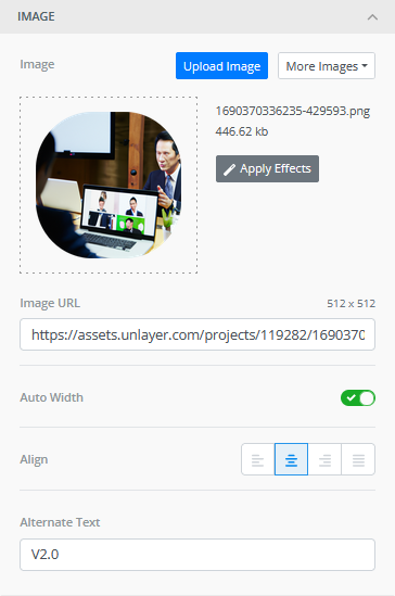
For each image you can set various properties:
Alternative Text is to provide a textual description of the image's content for impaired individuals using screen readers.
Note
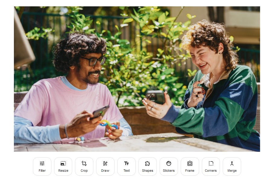
In addition, you can click Apply Effects which opens an editing tool with basic functionality, such as rounding up edges or resizing the image.
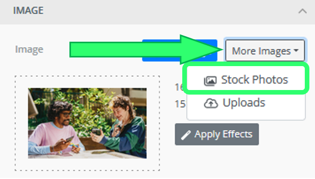
Moreover, if the AI is not helpful enough, there is an option to search through stock photos.
Go to More Images drop-down and choose Stock Photos.
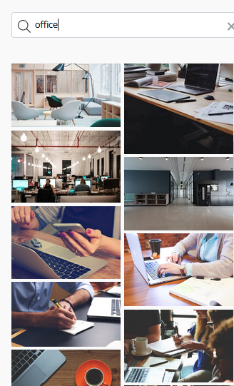
Insert the keyword describing your image. For example 'office'. The list of photos will be shown for you to choose from. Click the preferred image. All done!
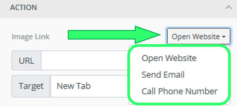
Action section allows you to create an event. It triggers a specific action when an image is clicked by the user. We can open a website, send an email or call a phone number.
If you toggle more options in the General section you can set the padding for the four sides around your header.
In the Responsive Design you can decide whether to hide or to show the image on the Desktop version (or in the other tab, see point 2, the Mobile version).
Drag & Drop the button component into the template to structure your email.
You can set the options for Desktop or Mobile devices.

Add a Display condition by clicking in the box.
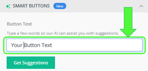
Use Smart Buttons to generate automatically a button by inserting at least two keywords:
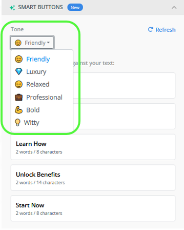
Click on Get Suggestions to choose the tone:
After choosing the preferred tone, you will see five suggestions for your button's text.
Action section allows you to create an event. It triggers a specific action when a button is clicked by the user. We can open a website, send an email or call a phone number.
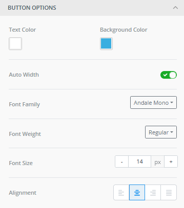
The Button options allow you to specify the background, font, text color etc.
The Spacing section sets the configuration for padding, border and rounded border. More Options helps you configure all those aspects from every side.
Note
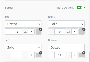
Here is the example configuration for the Border with a dotted top and bottom side of a button:
Result:
If you toggle more options in the General section you can set the padding for the four sides around your button.
Note
There is a difference between padding configured here and in the Spacing section - General's padding is for a button element, Spacing's padding is for a text element inside the button box.
In the Responsive Design you can decide whether to hide or to show the button on the Desktop version (or in the other tab, see point 2, the Mobile version).
Drag & Drop the divider component into the template to structure your email.
You can set the options for Desktop or Mobile devices.

Add a Display condition by clicking in the box.
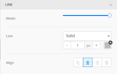
In the Line section you can decide on the properties of your divider. You can change its width, a type of line, a color or an alignment.
If you toggle more options in the General section you can set the padding for the four sides around your divider.
In the Responsive Design you can decide whether to hide or to show the divider on the Desktop version (or in the other tab, see point 2, the Mobile version).
Drag & Drop the HTML component into the template to structure your email.
You can set the options for Desktop or Mobile devices.

Add a Display Condition by clicking in the box.
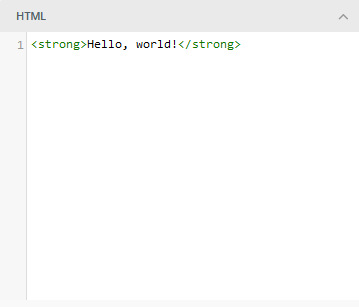
In the HTML section you can insert your HTML syntax to structure your element.
Note
As an example we added the Google search functionality as a HTML's block content.
<form action="http://www.google.com/search" method="get"> <fieldset> <input type="hidden" name="sitesearch" value="yoursite.com" /> <input type="text" name="q" size="31" maxlength="255" value="" /> <input type="submit" value="Google Search" /> </fieldset> </form>Result:
If you toggle more options in the General section you can set the padding for the four sides around your HTML element.
In the Responsive Design you can decide whether to hide or to show the HTML element on the Desktop version (or in the other tab, see point 2, the Mobile version).
Drag & Drop the menu component into the template to structure your email.
You can set the options for Desktop or Mobile devices.

Add a Display Condition by clicking in the box.
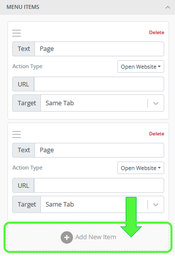
In the Menu items section you can add interactive texts that your menu will consist of. Each menu item has a text and an action type. It works similar to the button functionality. Add New Item allows you to add one more interactive button to your menu.
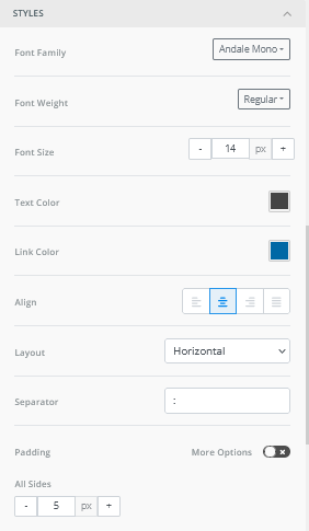
The Styles allows you to specify the following properties:
Note
Separator is an char element that is dividing your menu items. Let's use '-' as an example:
Padding configuration refers to menu items inside.
If you toggle more options in the General section you can set the padding for the four sides around your menu element.
In the Responsive Design you can decide whether to hide or to show the menu on the Desktop version (or in the other tab, see point 2, the Mobile version).
Blocks
You can use the Blocks section to structure your template.
Choose from a variety of columns in different distributions and drag & drop the one you need into the template.
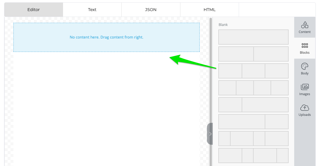
Once you dropped the block, the menu shows you the settings you already know from the Columns section we discussed earlier.
Body
The Body section allows you to set standardized settings that are applied to the whole template.
General
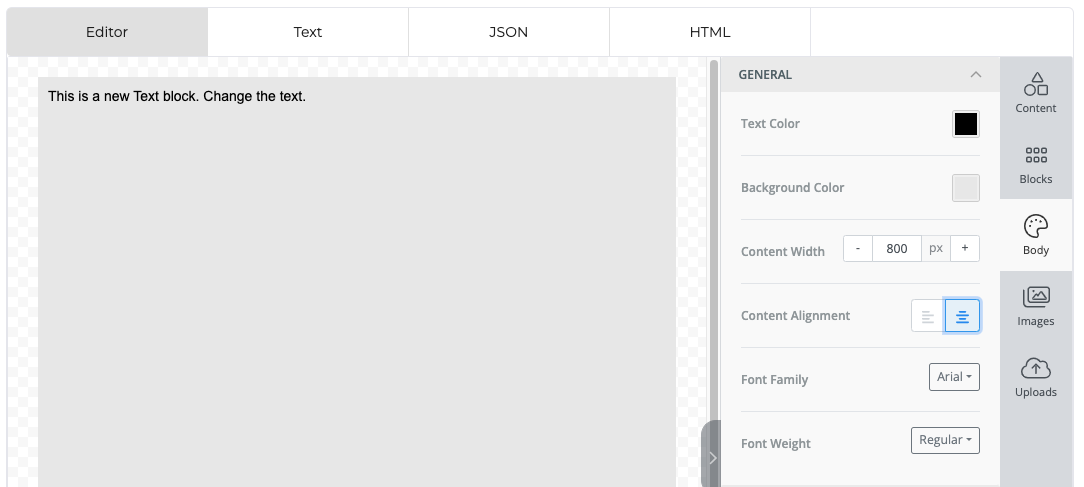
Set the text layout in the General settings. You can choose the
Text Color: Use Hex Code or RGB or choose from a color palette
Background Color: Use Hex Code or RGB or choose from a color palette
Width of your template: Set in Pixels
Alignment of your content: Left or Centered
Font Family: Access the fonts that are installed on your computer
Font Weight: Bold or Regular
Email Settings
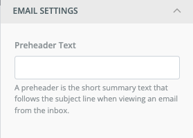
Add a Preheader Text for your Email Template.
Links
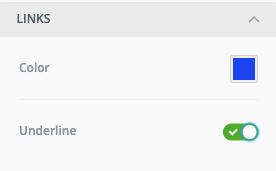
Set the link color and decide whether you would like to underline or not the links of your template.
Images
In the Images menu you can search for (licensed) free stock pictures on Unsplash, Pexels and Pixabay.
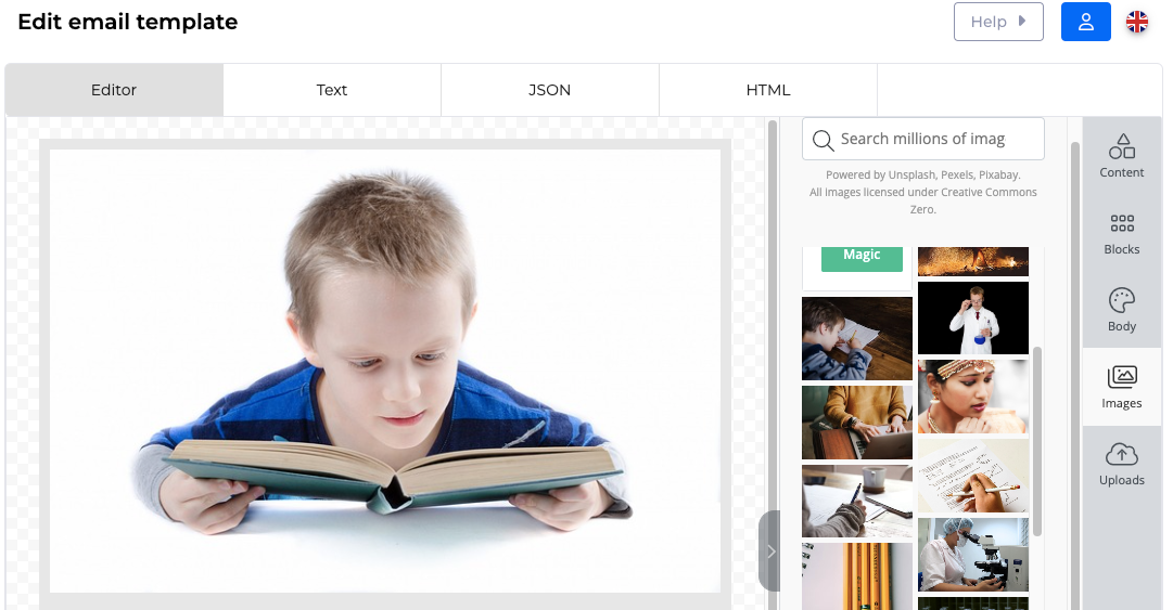
Via the See the magic button you can also access the AI interface that we described earlier.
Once you dragged the image into the template and you clicked on it, you can see the image settings of the Content section.
Uploads
The Uploads menu allows you to import pictures from your computer.
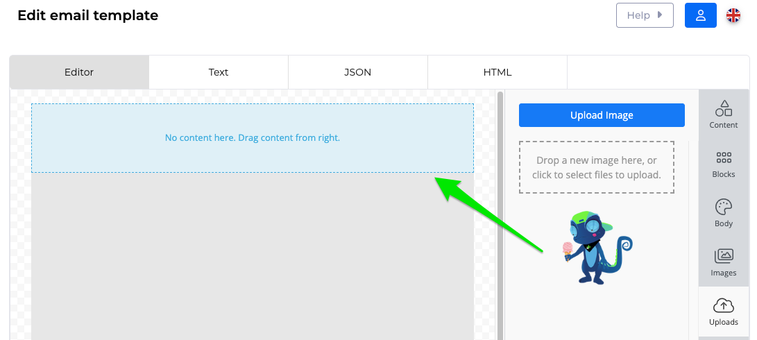
In order to upload pictures, you can
click on the Upload Image button or
click into the box underneath the button or

drag your pictures into this box.
Once you dragged the image into the template and you clicked on it, you can see the image settings of the Content section.
Text editor (merge tags & conditions)
This editor gives you the possibility to create a dynamic text for your template.

In order to do so you can insert:
Merge Tags: Use information coming from any field of our app to add variable content to your text.
Note
Example: Instead of hard coding a general greeting, use the actual name of the customer by inserting the correct field, here: {{customer.name}}.
In the left box, click on Merge tags. If you would like to replace a text, you can mark it first.
Decide if you would like to
Add a regular merge tag: Let us focus on this case first.
Add a merge tag based on a merge tag rule: Check out instructions below.
In the Select item drop down list, select where your merge tag shall come from, e.g. Customer.
In the second Select item drop down list, select a field that you would like to display, e.g. Name.
In the Merge tag details box you can see an example of the merge tag you selected.
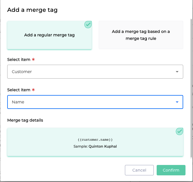
Click on
 to insert the tag.
Click regularly on
 on the top right corner of the editor.
Merge Tags Rules: Define a rule on which you base the following merge tags.
Note
Example: For each orderline you would like to display the order text.
In the left box, click on Merge tag rules.
In the Select item drop down list, select where your merge tag rule shall come from, e.g. Invoice.
In the Select item drop down list, select the information you would like to use for defining your rule, e.g. Orderlines.
Click on the Select Rule box that shows you a preview of your rule.
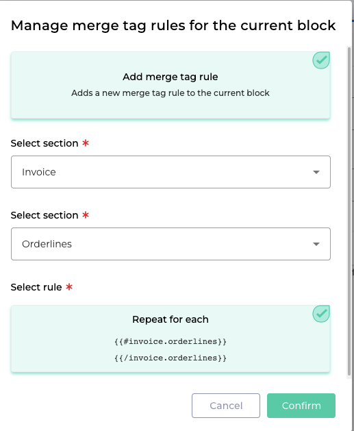
Then click on
 .
.In the left box, click in the middle of the two tags: {{#invoice.orderlines}} HERE {{/invoice.orderlines}}.
Then repeat the procedure for inserting Merge Tags as explained above.
Choose the option Add a merge tag based on a merge tag rule.
For our exemple select the items Invoice > Orderlines > Ordertext:
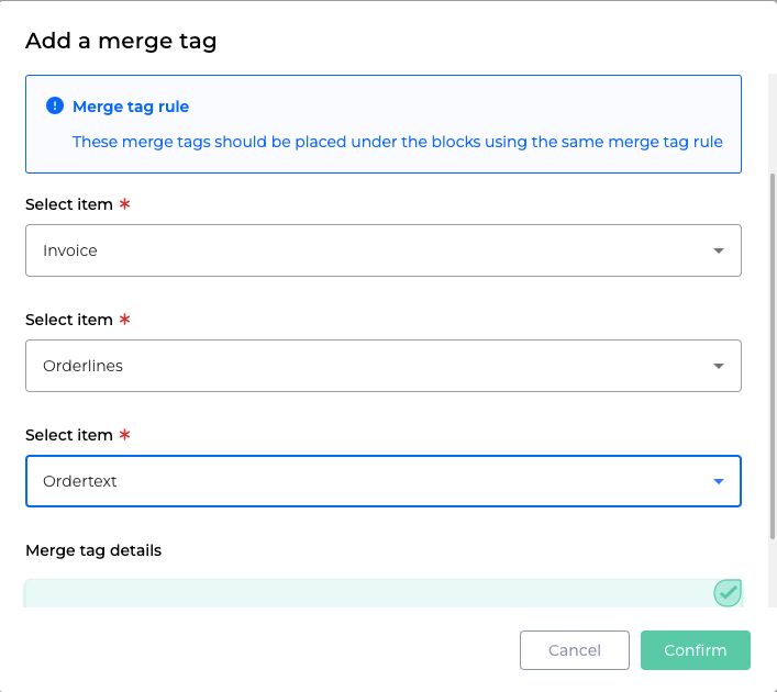
Then click on
 .
.Before continuing with the next possibility you have in the text editor, let us have a look on the current result of our template:

Click regularly on
 on the top right corner of the editor.
Display Conditions: Show or hide content depending on defined criteria.
Note
Example: Image you would like to insert in our example above the dates of the period of the subscription product.
Based on our recent learnings, we insert two new merge tags using our merge rule: {{period_from.date_medium}} and {{period_to.date_medium}}.
To enhance readability, we add the symbols ">" and "-".
Seeing the results we are not very happy:

The symbols we used are repeated unnecessarily.
To avoid this, we will only display the line if needed.
Mark the information you would like to display conditionally.
Click on Display conditions.
The Manage display conditions for the block window opens.
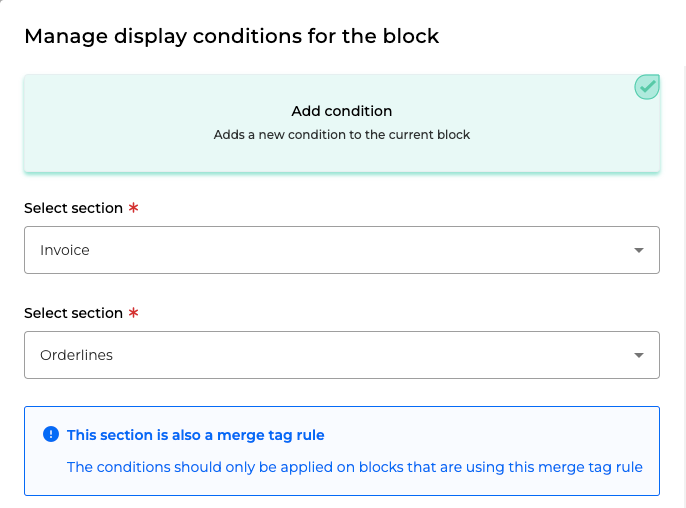
For this example choose in the Select section drop downs: Invoice > Orderlines.
Note
We are using the same section as for the line that we would like to show conditionally.
In the next two Select section drop downs add for this example: Period from > Date time medium.
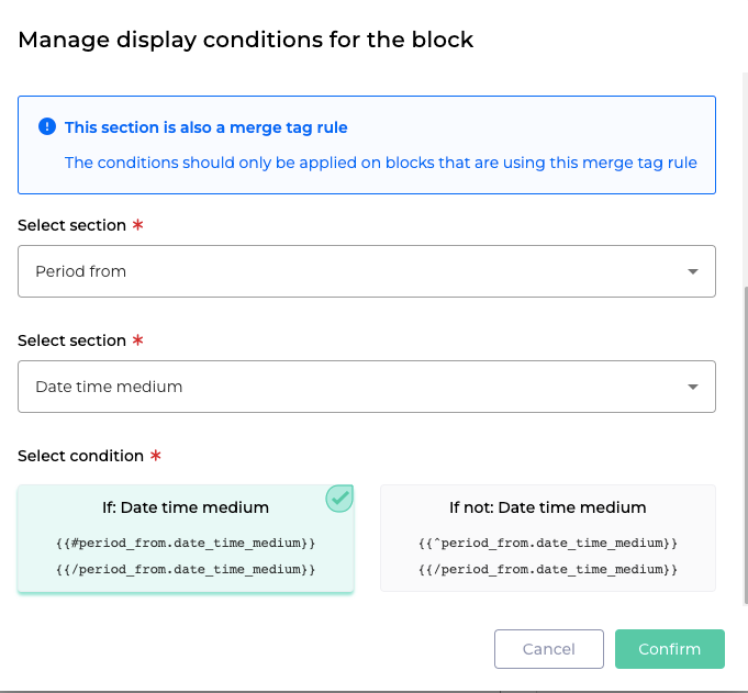
Select condition: Choose whether you would like to show the line
if the the condition is fulfilled
or if it is not fulfilled.
Click on
 .
.Now let us have a look at the result:

You can see that the symbols ">" and "-" are only shown in the correct line.
Note
You can use merge tags, merge rules and conditions in several situations:
To make the body of the email more dynamic (as we just saw).
For adding a variable subject line:

For displaying images you can use merge rules and conditions:
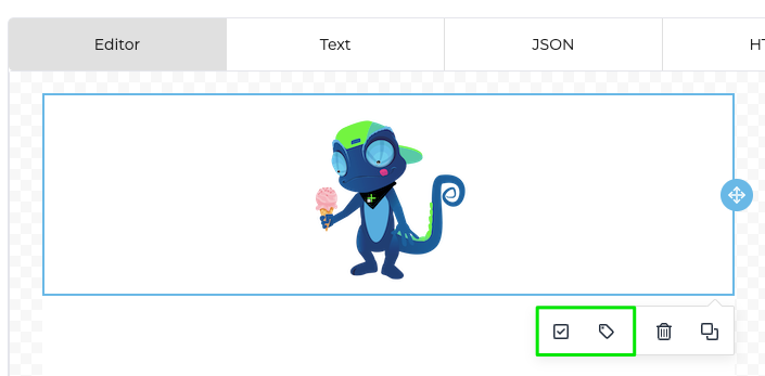
Click regularly on
 on the top right corner of the editor.
Preview
In order to check the template you just created, use the Send Preview button and confirm or change your email address:

Great! Now you can create dynamic email templates using merge tags, merge tag rules and conditions.
