Checkout
Checkout is the point in the shopping process where consumers finalize their purchases and pay a business for certain products or services.
Checkout branding
This guide shows you how you can style your payment window.
With the Checkout Style Editor for Billwerk+ Payment Checkout, you can style the payment window by changing colors, text, and much more. If you combine this with uploading your logo in the payment window, you can achieve a payment window that better matches your brand.
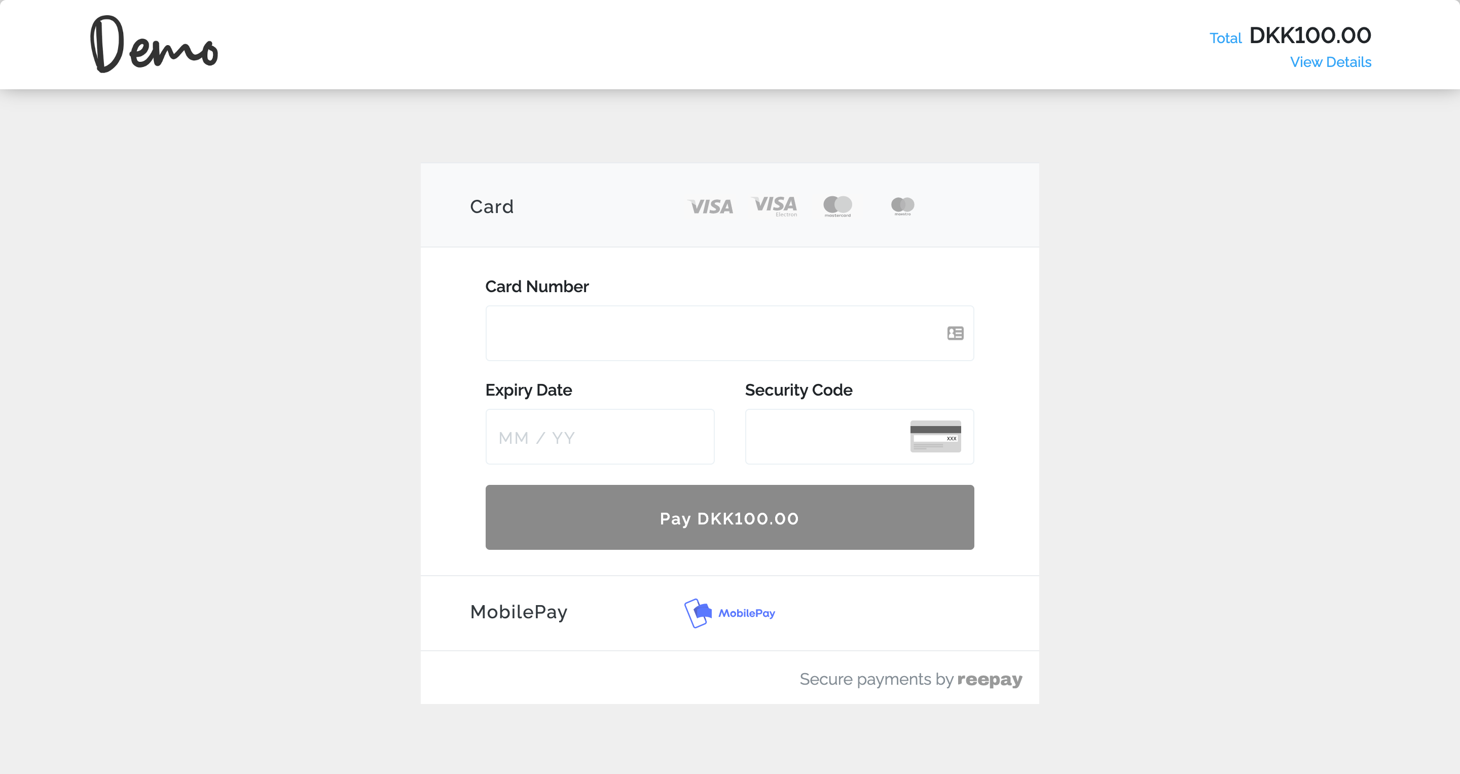
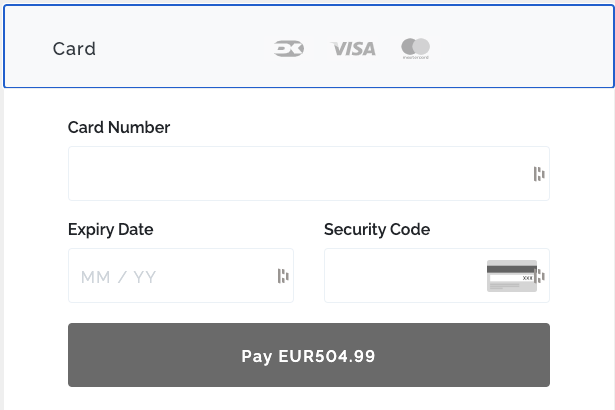
Payment window without extra styling
The branding of your payment window is optional. If you do not have the time or the capacities to work on it right now, you can leave it as it is by default and think about the styling later.
In this case your payment window will look like this:
Checkout interface
Billwerk+ Payments provides two user interfaces to you that we need to distinguish:
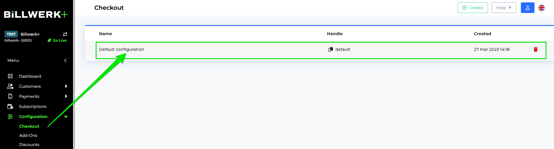
The interface we are looking at in this article can be found under Configurations > Checkout.
The checkout helper can be found under Developers > Checkout Helper. This is the subject of another article.
Once you clicked on Default Configuration you can edit the different sections of the Checkout Edit Page. Let us have a look on these sections in detail.
Identity
Within this section you can set the Name of your check configuration and set a Handle.
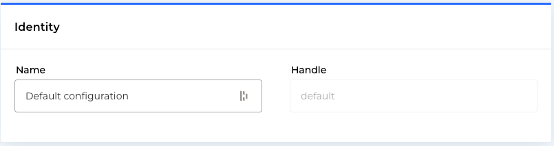
This helps you to identify your configuration in case you use several different configurations for checkouts.
Locale
Here you can set the language of your checkout by using the dropdown list we provide.
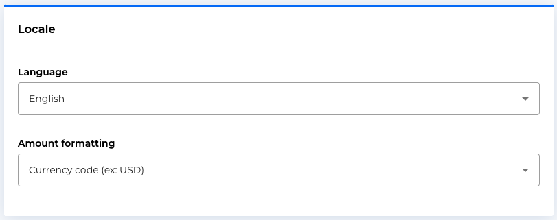
In the Amount formatting field you can decide how to display currencies.
Payment Methods
In this section, you can select whether you would like to provide all Payment Methods to the customer or with you would like to present only a selection.
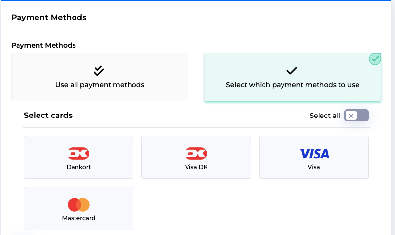
After this choice about the payment method selection, you can decide whether or not you would like to co-brand the DankOrt Card. You can choose between:
No preference
Dankort
Visa
Read more about Dankort and if you leave the choice to your customer.
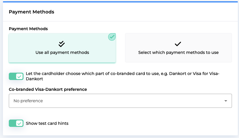
On the bottom of the box, you can decide if you would like to display test card information or not to the customer.
In the Payment Method Order box below, you can decide whether you would like to arrange the selected payment methods in a certain order.
Design
Finally we come to the styling part of your checkout.
Once you uploaded your logo, you can see the preview right next to the upload.
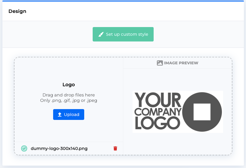
Click on Set up custom style to open the Checkout Style editor.
We will discuss this interface in the next article.
Checkout style editor
This editor allows you to adapt the style of the checkout window (also for the subscription part) to your corporate design.
You can find the following chapters:
Access to the editor
To open this interface
Click on Configuration > Checkout.
On the Checkout Page, click on one of your configurations in the list. If you start, you can click on Default Configuration.
On the Checkout Edit Page, scroll to the Design box.
Click on Set up custom style.
The Checkout Style page opens.
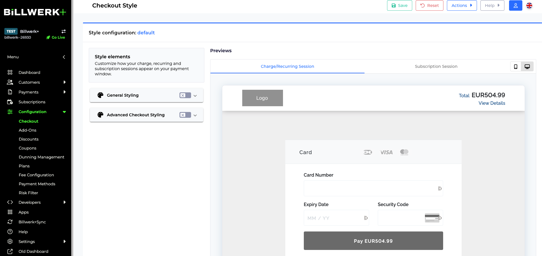
Great! Since you are already here, let us have a little tour of the interface.
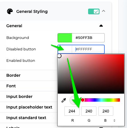
General styling
In this interface you can customize how your charge, recurring and subscription sessions appear on your payment window.
Caution
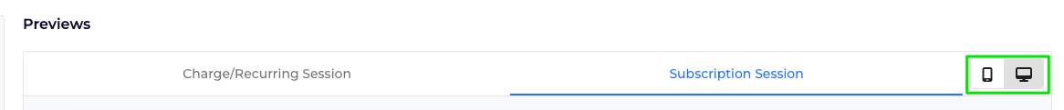
Please beware that you can style either the checkout for Charge/ Recurring Session or a Subscription Session.
In the Previews part of the interface you can switch between the two tabs.
Consider also to test the two devices Mobile and Desktop:
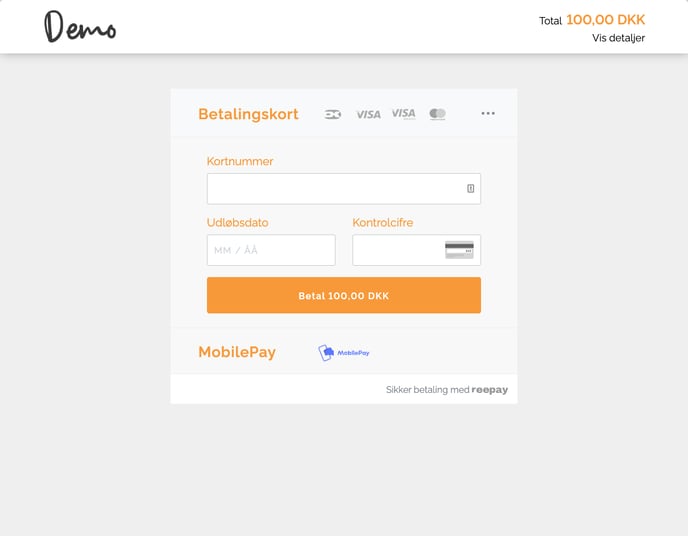
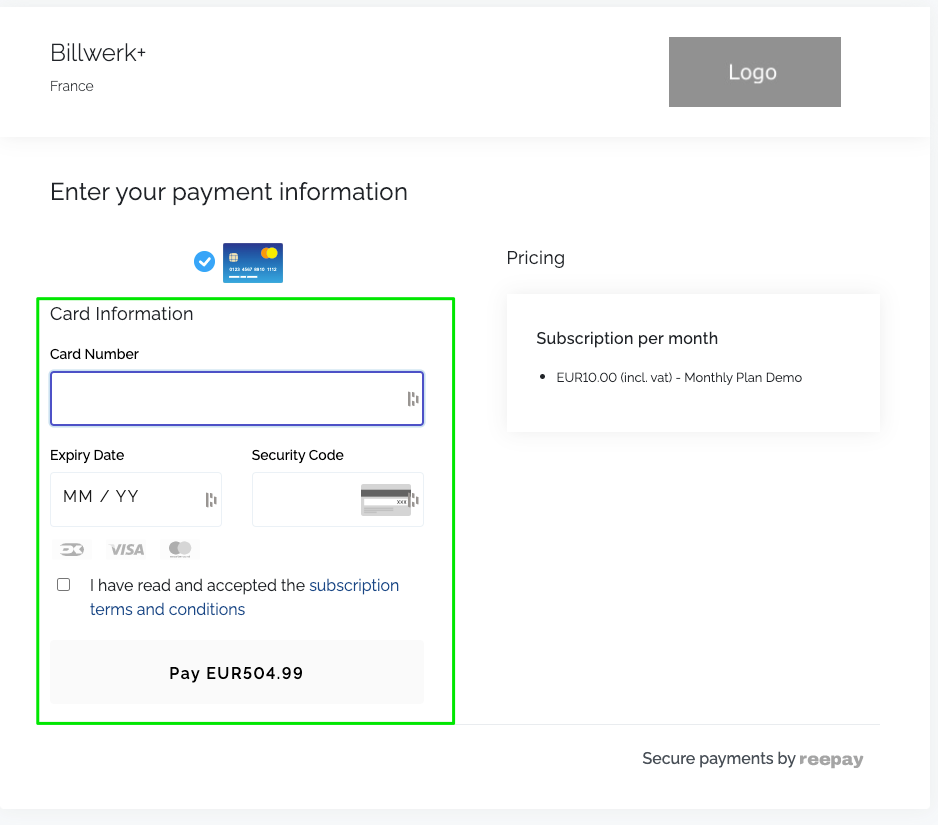
The General Styling applies to this part of the checkout for the Charge/ Recurring Session :
and is also valid for this part of the Subscription Session:
We listed all options you have in the General styling section:
General | Choose the color of: > the Background. > the Disabled button. > the Enabled button. |
Border | > Focused: Click into the fields on the preview (e.g. Card Number) to see the effect. > Invalid: This effect will appear if the clients types invalid data into the fields. > Standard: This is the normal appearance of the borders, without clicking into them, or flagging invalid or valid information. > Valid: Choose the color that shows that the client filled in the fields correctly. NoteYou do not have to specify a width, if you are fine with the default width. |
Font | > Color: Pay attention on the readability of the text, and consider color blind clients. > Font Family: You can choose between 12 popular fonts. > Font Size: Letter size on desktop (in Pixel). > Mobile Font Size: Letter size on mobiles (in Pixel). We suggest to test the outcome on your device. > (Mobile)Font weight: The effect depends on the font you chose. |
Input border | Explanation see border. |
Input placeholder text | You can test with the Expiry Date placeholder MM/YY. Explanation see Font. |
Input standard text | For testing, type some text into the fields (e.g. Card Number) to see the effect. Explanation see Font. |
Labels | Styling of the field names, e.g. Card Number. Explanation see Font. |
Pay button | Style the text "Pay EUR XXX" of the main button of the checkout. For changing the background color of the button, please use the General section we discussed on the top of this table. Explanation see Font. |
Advanced checkout styling
In contrary to the General styling we just saw, the Advanced Styling option change between Checkout and Subscription . In order to switch between the two options, you click either on the Charge/ Recurring Session tab or on the Subscription Session tab in the Preview part of the screen.
For explanation of the menu, check Fonts in the chapter General Styling.
General checkout | Change the color of the Continue button you will find, when you click on MobilePay or ViaBillon the Preview screen. |
Order line name | Scroll to the top and click on View Details to see the changes of these three configuration items. |
Order line quantity | |
Order line amount | |
Payment method title | Change the style of the words Card, MobilePay and ViaBill on the check out. |
Payment description | To see the change, scroll in the Preview section on the top, to see the words Total and View Details in the same banner than your logo. |
Payment amount | To see the change, scroll in the Preview section on the top, to see the Payment Amount in the same banner than your logo. |
Advanced subscription styling
In contrary to the General styling we just saw, the Advanced Styling option change between Checkout and Subscription . In order to switch between the two options, you click either on the Charge/ Recurring Session tab or on the Subscription Session tab in the Preview part of the screen.
For explanation of the menu, check Fonts in the chapter General Styling.
General subscription | Box shadow: Put a shadow effect behind the Pricing box. |
Company name | Change the style of the company name that is displayed on the same banner than your logo. |
Company address | Change the style of the address that is located beneath the company name. |
Pricing item title | Change the style of the title "Subscription per month" in the Pricing box. |
Pricing item row | Change the style of the line of the bullet point beneath the title in the Pricing box. e.g. EUR10.00 (incl. vat) - Monthly Plan Demo |
Title | Change the style of the title "Enter your payment information". |
Subtitle | Change the style of the subtitle "Card Information". |
Terms | Change the style of the line "I have read and accepted the subscription terms and conditions". |
Actions
You have four buttons on the top right of your screen:
Save: You can click to save your configuration and make it available for other users.
Reset: Deletes all changes that you made to the Style configuration and brings you back to the Checkout Interface.
Actions: Opens the JSON Editor.
Help: Guides you to this Help center or the Developer documentation.
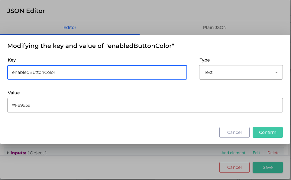
JSON Editor
This interface allows you to insert Plain JSON in order to avoid manual configuration :
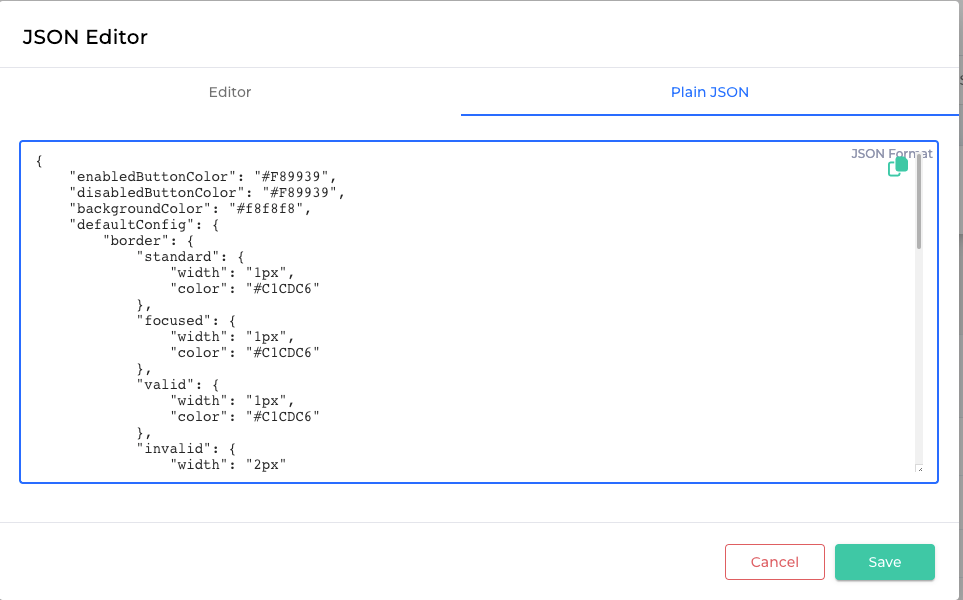
You could for example enter this code snippet and change all the parameters you would like directly in there:
{ "enabledButtonColor": "#F89939", "disabledButtonColor": "#F89939", "backgroundColor": "#f8f8f8", "defaultConfig": { "border": { "standard": { "width": "1px", "color": "#C1CDC6" }, "focused": { "width": "1px", "color": "#C1CDC6" }, "valid": { "width": "1px", "color": "#C1CDC6" }, "invalid": { "width": "2px" } } }, "paymentMethodTitle": { "color": "#F89939", "size": "26px", "weight": 600 }, "paymentDescription": { "color": "#040707", "size": "18px", "weight": 400 }, "paymentAmount": { "color": "#F89939", "size": "24px", "weight": 600 }, "labels": { "color": "#F89939", "size": "20px", "weight": 400 }, "inputs": { "border": { "standard": { "width": "1px", "color": "#C1CDC6" }, "focused": { "width": "1px", "color": "#C1CDC6" }, "valid": { "width": "1px", "color": "#C1CDC6" }, "invalid": { "width": "2px" } } }}You can also enter keys manually using the Editor .